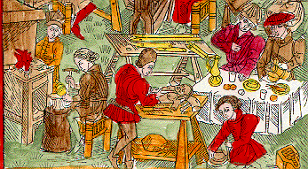
The Children of Mercury - detail

Three of the extant printed Planet Books are very closely related to one another: two chiroxylographic works (with printed pictures and manuscript texts) in Berlin and Copenhagen, and an incomplete blockbook Planets (only two planets) bound in a volume of sermons in Schwabach. When Lippman published the Berlin Planet Book in 1895, in order to increase the legibility of the illustrations, he caused the zincotype plates to be retouched to remove evidence of the heavy coloring of the original. His aims in doing so were both practical and esthetic; not only did he believe, no doubt correctly, that the mass of grays in a black and white photograph would obscure the content of the pictures, he also felt (as have many art historians and curators past and present) that coloring the prints "disfigured" the works.
I am inclined to disagree, on both theoretical and esthetic grounds, that the print is somehow "better" uncolored. The blockbook Planets are almost always colored; of ten extant German series or partial series of the planets, nine are colored. This fate is so universal that the designer of the blocks must have expected that someone was going to color the outlines the block would produce. Certainly coloring increases the legibility of the iconographically dense depictions of the "children".
The illustrations of the present Planet Book are based on Lippman's plates, photocopies of which I have re-colored. My decisions about what and how to paint are based on the color plates available in Blockbuecher des Mittelalters, Palmer, and Schretlen (see below). The colors are ground pigments (minium, madder, massicot, burnt umber, and two terre vertes) in glair medium; decisions about which pigments to use are based on Hind and on observation of the color plates.
The poems are my translations of the twenty-four German line verses which commonly accompanied the blockbooks. these translations have been used in the catalogs for the two recent exhibitions of the famous Housebook at the National Gallery in Washington, DC and at the Frick Collection (Waldburg, 1998). Both a text-only version of the poems and (if you just have to see how bad this poetry is in German) the German text of Mercury's verses are available. The poems are set in the font GoodCityModern, which Andrew Meit based on Gutenberg's 42-line Bible.


